Responsive Web Design with Bootstrap: A Comprehensive Guide for Beginners
- On 09-Nov-23
In a world where screen sizes are as diverse as the people using them, responsive web design is no longer a luxury, but a necessity. Bootstrap is a powerful tool that can help you create websites that adapt seamlessly to any device, ensuring that your message reaches the widest possible audience.
With Bootstrap, you can focus on creating a single, well-designed layout that will look great on any screen. Bootstrap's flexible grid system and media queries will take care of the rest, ensuring that your website looks its best on every device.
So if you're looking for a way to create a website that is both beautiful and responsive, then Bootstrap is the perfect solution for you.
Getting started with Bootstrap
In this section, we will explore the installation process, unravel the intricacies of Bootstrap's core components, and demonstrate how to utilize them to construct a basic responsive layout.
There are a few different ways to install Bootstrap:
Download the Bootstrap source files: You can download the Bootstrap source files from the Bootstrap website. Once you have downloaded the files, you can include them in your project by adding the following lines to your HTML document:
HTML
<link rel="stylesheet" href="css/bootstrap.min.css">
<script src="js/bootstrap.min.js"></script>
Use a package manager: You can use a package manager such as npm or Yarn to install Bootstrap. To install Bootstrap with npm, run the following command:
npm install bootstrap
Use a CDN: You can use a content delivery network (CDN) to host the Bootstrap files. To use a CDN, simply add the following lines to your HTML document:
HTML
<link rel="stylesheet" href="https://cdn.jsdelivr.net/npm/bootstrap@5.2.0/dist/css/bootstrap.min.css">
<script src="https://cdn.jsdelivr.net/npm/bootstrap@5.2.0/dist/js/bootstrap.min.js"></script>
Basic Bootstrap components
Bootstrap includes a variety of basic components that can be used to create responsive websites. Some of the most common components include:
Grid system:
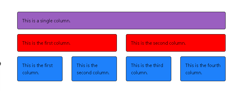
The grid system is a flexible layout system that can be used to create a variety of layouts. The grid system is based on a 12-column layout, and it can be used to create both fluid and fixed layouts.
Containers:
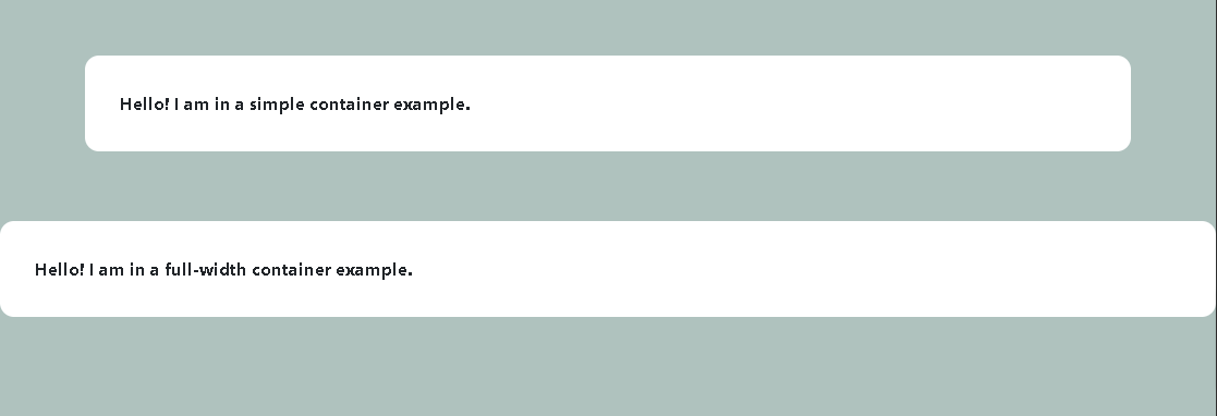
Containers are used to group content together. Containers can be used to create both full-width and fixed-width layouts.
Rows:
Rows are used to create horizontal groups of columns. Rows are always contained within a container.
Columns:
Columns are used to create vertical groups of content. Columns are always contained within a row.
Typography:
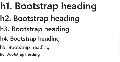
Bootstrap includes a variety of pre-styled typography elements, such as headings, paragraphs, and lists.
Buttons:

Bootstrap includes a variety of pre-styled buttons, such as primary buttons, secondary buttons, and danger buttons.
Using Bootstrap classes to create a basic responsive layout
The following is an example of a basic responsive layout that uses Bootstrap classes:
HTML
<div class="container">
  <div class="row">
    <div class="col-sm-12 col-md-8 col-lg-6">
      <h1>My website</h1>
      <p>This is a basic responsive layout.</p>
    </div>
    <div class="col-sm-12 col-md-4 col-lg-3">
      <ul>
        <li>Item 1</li>
        <li>Item 2</li>
        <li>Item 3</li>
      </ul>
    </div>
  </div>
</div>
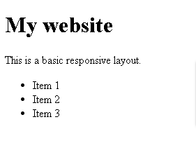
This layout will be displayed as a single column on small screens, such as smartphones. On medium-sized screens, such as tablets, the layout will be displayed as two columns. On large screens, such as desktops, the layout will be displayed as three columns.
The col-sm-12 class tells Bootstrap to display the element as a full-width column on small screens. The col-md-8 class tells Bootstrap to display the element as an 8-column element on medium-sized screens. The col-lg-6 class tells Bootstrap to display the element as a 6-column element on large screens.
By using Bootstrap classes, you can easily create responsive layouts that will look great on any screen size.
Creating responsive layouts with Bootstrap:
Embarking on a Journey of Responsive Design with Bootstrap
It ensures your website looks and functions flawlessly on a diverse array of devices. Bootstrap, with its grid system, breakpoints, and media queries, is your trusty companion in this journey.
The Grid System: A Foundation for Structure and Flexibility
Bootstrap's grid system simplifies the art of responsive layout creation. This 12-column structure offers a well-organized framework for your content. Let's simplify this with an example:
html
<!DOCTYPE html>
<html lang="en">

<head>
    <meta charset="UTF-8">
    <meta name="viewport" content="width=device-width, initial-scale=1.0">
    <title>Responsive Web Design Example</title>
    <link href="https://cdn.jsdelivr.net/npm/bootstrap@5.0.2/dist/css/bootstrap.min.css" rel="stylesheet">
</head>

<body>
    <div class="container">
        <div class="row">
            <div class="col-lg-6" style="background-color: red;">Left Section</div>
            <div class="col-lg-6" style="background-color: blue;">Right Section</div>
        </div>
    </div>

    <script src="https://cdn.jsdelivr.net/npm/bootstrap@5.0.2/dist/js/bootstrap.bundle.min.js"></script>
</body>

</html>

These "col-lg-6" classes ensure a balanced two-column layout on large screens, seamlessly stacking into one column on smaller screens. The beauty of responsive design is its ability to optimize screen space.
Breakpoints: Adapting to the Nuances of Different Devices
Breakpoints are predefined thresholds that define the transition between device categories. Their judicious use tailors your layout to specific device characteristics. Let's simplify this with an example:
html
<div class="container">
  <div class="row">
    <div class="col-lg-6 col-sm-12">Two Columns on Large Screens, Full Width on Small</div>
    <div class="col-lg-6 col-sm-12">Another Two Columns on Large Screens, Full Width on Small</div>
  </div>
</div>

The "col-lg-6 col-sm-12" classes ensure a two-column layout on large screens and a user-friendly full-width experience on smaller screens.
Media Queries: Fine-Tuning the Details for a Captivating Experience
Media queries, the artisans of responsive design, enable you to apply specific styles based on the device's attributes. Let's keep it simple with an example:
html
<div class="container">
  <div class="row">
    <div class="col-md-6">
      <div class="responsive-element">Color Change on Smaller Screens</div>
    </div>
  </div>
</div>

<style>
  @media (max-width: 767px) {
    .responsive-element {
      background-color: lightblue;
      color: white;
    }
  }
</style>

In this example, when the screen width is less than 768 pixels, a media query triggers a change in the background color to light blue and text color to white. This enhances the readability and visual appeal of the element on smaller screens, contributing to a better user experience.
By blending the grid system, breakpoints, and media queries, you create responsive layouts that are both elegant and adaptable. Bootstrap is your compass in this journey. So go forth and craft websites that captivate users on every device.
Advanced Bootstrap Features: Crafting Custom Responsive Layouts
Bootstrap has many advanced features that allows you to craft custom layouts tailored to your specific needs. Two such features are using Bootstrap's components and mixins, which allow you to create intricate and highly responsive designs.
Using Bootstrap's Components for Custom Responsive Layouts
Bootstrap offers a treasure trove of pre-built components that you can wield to create unique and responsive layouts. Let's illustrate this with a practical example:
Consider the need for a sophisticated navigation bar that elegantly transforms on different screen sizes. Bootstrap simplifies this with a highly detailed code example:
html
<nav class="navbar navbar-expand-lg navbar-light bg-light">
  <a class="navbar-brand" href="#">My Website</a>
  <button class="navbar-toggler" type="button" data-toggle="collapse" data-target="#navbarNav" aria-controls="navbarNav" aria-expanded="false" aria-label="Toggle navigation">
    <span class="navbar-toggler-icon"></span>
  </button>
  <div class="collapse navbar-collapse" id="navbarNav">
    <ul class="navbar-nav">
      <li class="nav-item active">
        <a class="nav-link" href="#">Home <span class="sr-only">(current)</span></a>
      </li>
      <li class="nav-item">
        <a class="nav-link" href="#">About</a>
      </li>
      <li class="nav-item">
        <a class="nav-link" href="#">Contact</a>
      </li>
    </ul>
  </div>
</nav>
.gif)
In this example, Bootstrap's components—navbar, navbar-toggler, collapse, and many classes—combine seamlessly to create a responsive navigation bar. On larger screens, it displays all menu items, while on smaller screens, it transforms into a collapsible menu, providing an optimal user experience.
Using Bootstrap's Mixins for Complex Responsive Layouts
Mixins are a powerful tool for creating responsive layouts. They allow you to mix and match Bootstrap's classes to achieve unique results. Let's dive into a complex layout scenario with a code example:
Imagine you need a card element with a flexible width that also responds to screen size. Bootstrap's mixins come into play:
html
<div class="container">
  <div class="row">
    <div class="col-md-6">
      <div class="card flex-fill">
        <div class="card-body">
          This card adapts its width on different screens.
        </div>
      </div>
    </div>
  </div>
</div>
In this example, the "col-md-6" class creates a responsive column, while the "flex-fill" class ensures that the card adapts its width as the screen size changes. The result is a visually appealing and functional card element on any device.
By using Bootstrap's components and mixins with these highly detailed code examples, you unlock a world of possibilities for crafting custom and highly responsive layouts. These advanced features are the tools that transform your designs from good to exceptional, ensuring an unparalleled user experience.
Best practices for responsive web design with Bootstrap:
Mastering responsive web design with Bootstrap is not just about understanding the tools but also knowing how to use them effectively. Here, we present the best practices that will elevate your responsive design game.
Using Bootstrap's Responsive Utilities
Bootstrap provides a set of responsive utility classes that enable you to control the visibility, alignment, and styling of elements on different screen sizes. These classes are invaluable for creating a seamless user experience. Here's how you can use them:
Visibility: You can control the visibility of elements by using classes like d-none (hides the element) and d-md-block (displays the element on medium-sized screens and up). For example:
html
<div class="container">
  <div class="row">
    <div class="col-md-6 d-none d-md-block">Visible on Medium Screens and Up</div>
  </div>
</div>
.gif)
Alignment: Bootstrap also offers alignment classes. For instance, you can center-align content using mx-auto, and this centering adapts to different screen sizes:
html
<div class="container">
  <div class="row">
    <div class="col-md-6 mx-auto">Center-Aligned on Medium Screens and Up</div>
  </div>
</div>
Avoiding Common Responsive Web Design Mistakes
While creating responsive designs, it's essential to steer clear of common pitfalls. Here are some mistakes to avoid:
#1. Overloading with Content: Avoid cramming too much content onto small screens. Prioritize essential information to maintain a clean and usable design.
#2. Ignoring Performance: Image and resource optimization is critical for responsive design. Neglecting this can lead to slow loading times.
#3. Disregarding Testing: Always test your design on various devices to ensure it functions as expected. Ignoring this step can result in a frustrating user experience.
#4. Neglecting User Feedback: Pay attention to user feedback and adapt your design based on their needs and preferences.
By embracing Bootstrap's responsive utilities and avoiding common responsive design mistakes, you'll create designs that not only adapt but also excel on diverse devices. These best practices are the guiding principles for crafting user-friendly, responsive websites.
Conclusion:
In this guide to responsive web design with Bootstrap, hopefully you have gained a solid understanding of the fundamental concepts and techniques involved.
- Importance of responsive design in today's digital landscape, where users access websites from a wide range of devices with varying screen sizes and resolutions.
- Explored the core elements of Bootstrap, including the grid system, breakpoints, and media queries, and how they can be used to create responsive layouts.
- Seen detailed examples of how to use Bootstrap's grid system to craft adaptable layouts that adjust effortlessly to different screen sizes.
- How media queries enable you to fine-tune the details of your layouts, ensuring optimal user experience on various devices.
- You have been introduced to advanced Bootstrap features, such as components and mixins, that can be used to create custom, highly responsive layouts.
- You have absorbed best practices for responsive web design, from using Bootstrap's responsive utilities for control to avoiding common pitfalls.
As you continue your journey in responsive design, you will encounter new challenges and opportunities. However, with the foundation you have built, you will be able to tackle these challenges with confidence and create websites that are both beautiful and effective.
So go forth and create! The possibilities are limitless.
FAQs:
FAQ 1: What is the difference between responsive web design and adaptive web design?
Responsive web design adapts content using fluid grids and CSS media queries for various screen sizes. Adaptive web design creates multiple device-specific versions. Responsive is one design for all; adaptive has specific versions for different devices.
FAQ 2: What are the benefits of using Bootstrap for responsive web design?
Bootstrap streamlines development with pre-designed components, responsive grids, and cross-browser compatibility. It's efficient, customizable, and backed by a supportive community, enhancing the user experience.
FAQ 3: How do I create a responsive layout with Bootstrap?
To create a responsive layout with Bootstrap, include Bootstrap files, use a container, utilize the grid system, apply responsive classes, and optionally add media queries for fine-tuning.
FAQ 4: What are some best practices for responsive web design with Bootstrap?
Best practices include a mobile-first approach, image optimization, thorough testing on various devices, content prioritization, performance considerations, and ensuring accessibility for all users.
FAQ 5: How can I test my responsive website on different devices?
Test on real devices, use browser developer tools for emulation, employ online testing tools, try responsive design testing tools, and conduct usability testing for an optimal user experience.